Mini Art School #2
Updating Graphic Organizers
I was inspired to revisit some graphic organizers I had previously created to reevaluate my design and layout after reading White Space Is Not Your Enemy. It is always a good idea to reevaluate past creations to improve upon them for the future.
Some graphic organizer designs that I chose to revisit were two that I created 2 1/2 years ago when I was taking a course Education and Computers at the beginning of my sophomore year at Rutgers. As a current graduate student, I felt I had more experience with creating effective instructional tools so I wanted to improve these earlier designs. Since I have been experimenting with using Screencast-o-Matic, I wanted to share my process of updating them with you in addition to sharing the original and final formats.
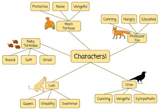
Professor Fox - Character Graphic Organizer
 |
| Version 1 |
 |
| Version 2 |
Here is my updated version of the Professor Fox Character Graphic Organizer. I chose to change the font type to be more easily readable to young readers. The text is more linear and has fewer embellishments than the original text. The text size is also increased as young readers are accustomed to larger text. Once I made these two adjustments, the pieces of my web were fairly crowded so I created additional space between character groupings so that there was a more logical flow around the text and images.
The Three Little Pigs - Story Map Graphic Organizer
 |
| Version 1 |
Here is my original version of The Three Little Pigs Graphic Organizer. It was designed to be used as a story map so that students would be able to use the visuals to help them retell the story at a later time. It includes the main characters of the short story along with the three important locations described in the text.
 |
| Version 2 |
Here is my updated version of The Three Little Pigs Graphic Organizer. First, I created a title to go along with the organizer. I adapted the design of the organizer to read from left to right as this is a fundamental print concept that we are teaching young children. This also aids in the logical progression of ideas. I eliminated extraneous text that I thought was unnecessary as students should be able to identify the names of the characters using visual clues.
Word Portraits
After Reading Design Basics Index, I chose to explore how typography choices can affect the tone and emotion conveyed through written text. We can call these factors the "voice" of each font which has the ability to convey a different message depending on the perception of the viewer.
Next, I complete an exercise in voice by analyzing twelve different fonts and explain my perception of the voice of each font and how that projects to the reader. I will accomplish this by selecting two words whose meaning is amplified through the voice of the font and then one word whose meaning directly contrasts with the voice of the font.
Font #1: Arial
Emphasis: Clarity and Order
Contrast: Frustration
Font #2: Coming Soon
Emphasis: Smooth and Order
Contrast: Frustration
Font #3: Corsiva
Emphasis: Flow and Elegance
Contrast: Modern
Font #4: Courier New
Emphasis: Typewriter and Formality
Contrast: Modern
Font #5: Crafty Girls
Emphasis: Fun-loving and Glitter
Contrast: Blunt
Font #6: Gloria Hallelujah
Emphasis: Serenity and Ribbon
Contrast: Arrow
Font #7: Impact
Emphasis: Power and Determination
Contrast: Shy
Font #8: Lobster
Emphasis: Sleek and Proud
Contrast: Terse
Font #9: Pacifico
Emphasis: Waves and Valley
Contrast: Barbed
Font #10: Shadows Into Light
Emphasis: Brisk and Ethereal
Contrast: Potent
Font #11: Syncopate
Emphasis: Spacious and Cloud
Contrast: Miniature
Font #12: Times New Roman
Emphasis: Routine and Method
Contrast: Suave
All text that you use in your classroom should be intentional and it is valuable to think about the unintentional or conflicting messages you may be sending based on your font choices! I hope that this exploration will help you in selecting appropriate fonts to use in your classroom to convey the emotion and tone that you are intending to convey in your name plates, environmental labels, graphic organizers, anchor charts, and various other texts.


This comment has been removed by the author.
ReplyDeleteHi Ruth! I'm glad you liked the screencast! I thought it was a nice way to showcase how easy Google Drawings is to use! I'm surprised that we saw similar fonts so differently! I guess that goes to show how we can't fully anticipate how our students may be interpreting our font choices too!
ReplyDelete